20 Inspirational And Original Comment Form Designs For Your Blog
Updated: January 25th, 2010
- Introduction
- Let's Go
- 1. blog.spoongraphics.co.uk
- 2. springydevelopment.co.uk
- 3. css-tricks.com
- 4. net.tutsplus.com
- 5. smashingmagazine.com
- 6. branded07.com
- 7. depcore.com
- 8. marcofolio.net
- 9. jankoatwarpspeed.com
- 10. dezinerfolio.com
- 11. sohtanaka.com
- 12. productivedreams.com
- 13. kevadamson.com
- 14. line25.com
- 15. markforrester.co.za
- 16. jrvelasco.com
- 17. gizmodo.com
- 18. instantshift.com
- 19. koodoz.com.au
- 20. elliotjaystocks.com
- Conclusion
- Comments (10)
 Introduction
If you follow web design at all, you probably see 5 billion top NN posts on a daily basis mentioning site and blog designs, fonts, icons, etc.
However, nobody seems to be paying attention to these little but important guys: comment forms.
If you have an appealing comment box, you are more likely to receive comments (this is based on days of scientific research that I imagined I did in my head) and your content is more likely to be re-shared, voted up, and saved.
I really do feel that way when I visit blogs, especially when an otherwise aesthetically pleasing site has a plain vanilla comment box.
Let's Go
So here we go. I have looked through hundreds of sites to make this collection, go ahead and let me know if you like it (yeah, I know, my comment box is not as spiffy as theirs).
I've also included my notes with the parts that I liked.
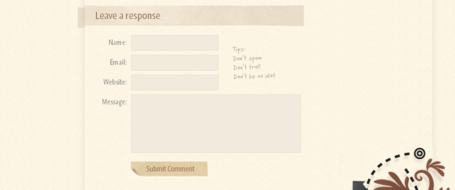
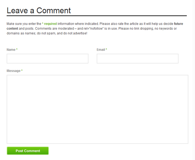
1. blog.spoongraphics.co.uk
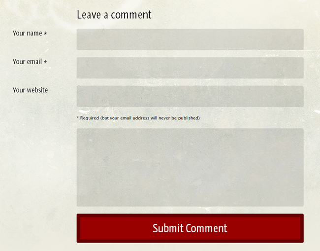
- interesting submit button
- fun background
- great font
- grungy
- border glow
- normal:

- focused:

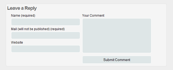
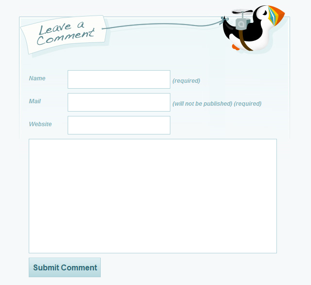
2. springydevelopment.co.uk
- 2 column
- wide submit button
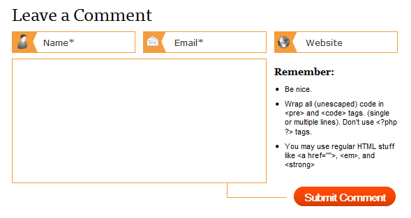
3. css-tricks.com
- Chris Coyier doesn't mess around with crappy designs – his website is superb in general
- normal:
![]()
- focused:
![]()
- internal disappearing labels
- dimming labels
- interesting submit button
- custom images
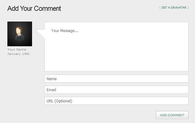
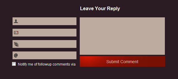
4. net.tutsplus.com
- tongue:
- internal disappearing labels
- appealing default avatar
5. smashingmagazine.com
- simplistic
- appealing submit button
- absence of author website – less spam
6. branded07.com
- fading
- interesting background
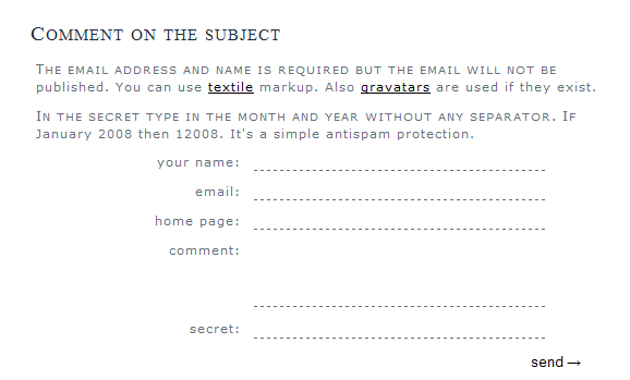
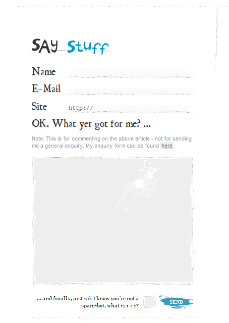
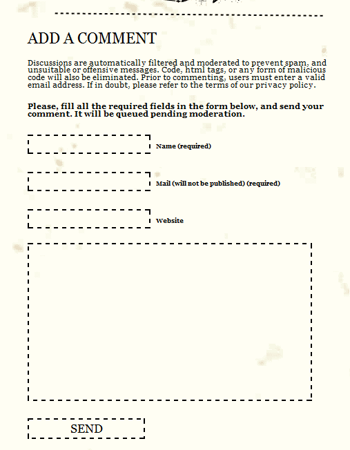
7. depcore.com
- simplistic
- unconventional – looks like a pad of paper or a letter
- contains an anti-spam measure
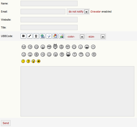
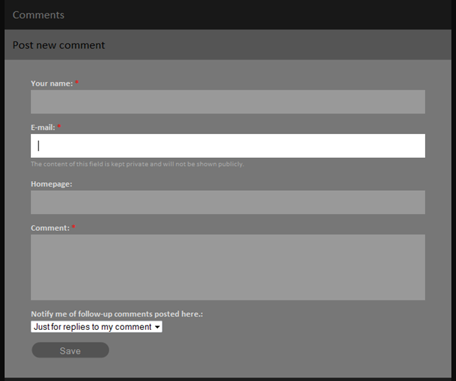
8. marcofolio.net
- notify/don't notify option (for the first time the design is cohesive – not some random checkbox under the submit button)
- lots of formatting buttons
- smilies
9. jankoatwarpspeed.com
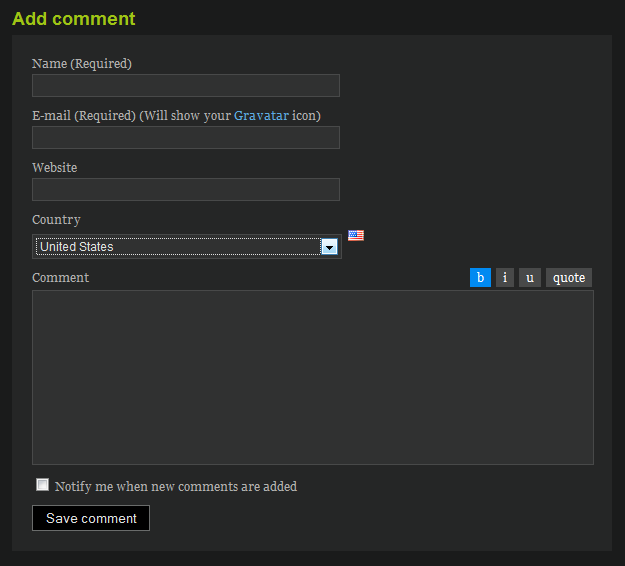
- handy and appealing formatting buttons
- flag next to the country – it then shows up next to each commenter, kind of cool:
10. dezinerfolio.com
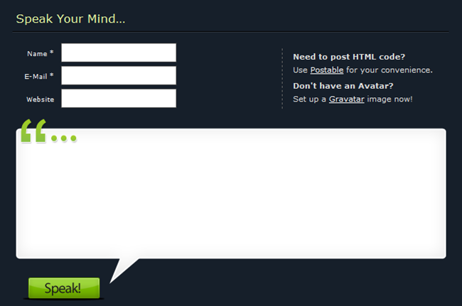
- highlight the field with focus – concentrate attention on one spot
- large padding
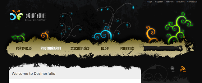
- by the way, they have an amazing header. I couldn't resist:
11. sohtanaka.com
- I love it
- custom submit button
- hovering quote
- very polished look
12. productivedreams.com
- the comment box actually sits *above* the comments – a radical, yet interesting approach
- custom icons
- really nice custom highlight on hover effect:
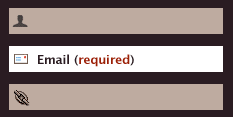
- usability and UX at their best
13. kevadamson.com
- grungy, sloppy – looks great!
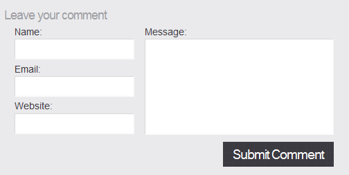
14. line25.com
- clean
- side by side
- symmetrical, exact
- I love it
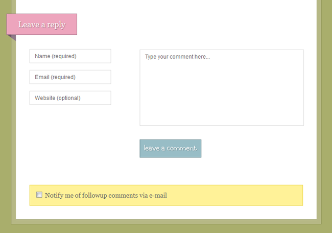
15. markforrester.co.za
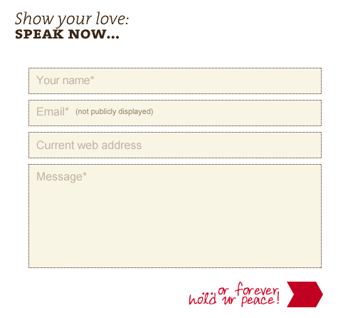
- colorful, crayon-like (though it looks better on the site itself – you need to see it in its natural habitat)
- internal disappearing labels
16. jrvelasco.com
- simple, and yet sophisticated
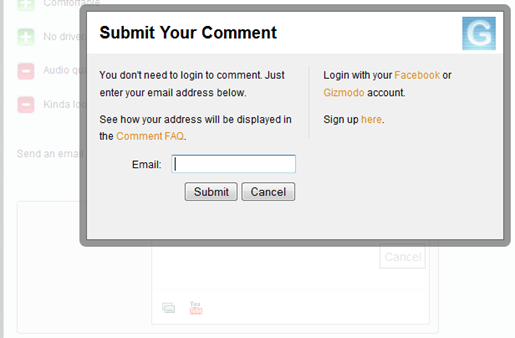
17. gizmodo.com
- very simple from the UX perspective:
- single line box, without the need to login first
- expands on focus
- no need to login even then, unless you want to – just enter your email
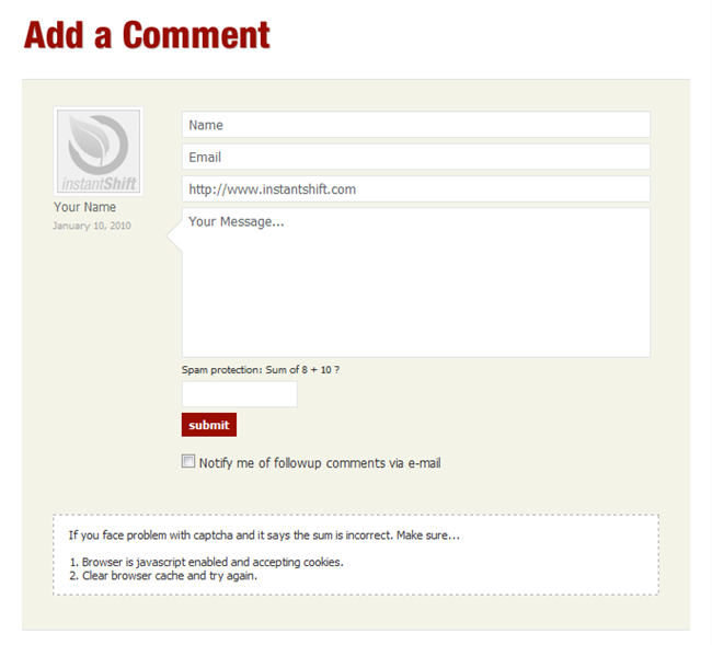
18. instantshift.com
- this is one of my favorites
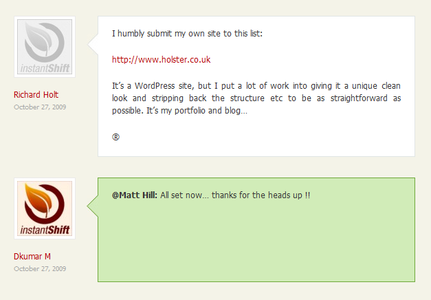
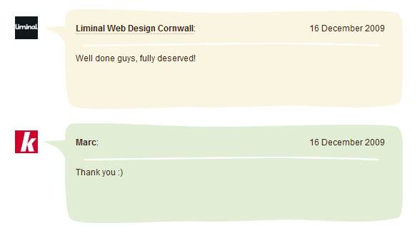
- I love, love, love the way the comments look, especially the way the author ones stand out:
19. koodoz.com.au
- internal disappearing labels
- the design itself, while seemingly not too special, mashes with comment list very well. Check it out – I think the curvy lines are very creative:
20. elliotjaystocks.com
- click the image – it's bigger than it looks
- if you can't tell (), the elements are MASSIVE, which makes this comment box pretty unique
Conclusion
If you liked this post, you might also enjoy
- BlogDesignBlog with 37 more comment form designs (though they're not as exciting).
- 1stwebdesigner with 77 comment form designs.
- Queness with 20 stylish web form designs.
So, what did you think? The comment box you're looking for is at the bottom of the page.
In the meantime, if you found this article useful, feel free to buy me a cup of coffee below.
